
Statiscal Data
Bar Graphs -
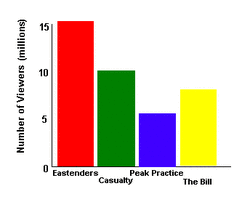
Bar Chart
A bar chart is a chart where the height of bars represents the frequency. The data is 'discrete' (discontinuous- unlike histograms where the data is continuous). The bars should be separated by small gaps.
A bar chart is a chart where the height of bars represents the frequency. The data is 'discrete' (discontinuous- unlike histograms where the data is continuous). The bars should be separated by small gaps.
Pie Charts -
A pie chart is a circle which is divided into a number of parts.
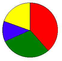
The pie chart above shows the TV viewing figures for the following TV programmes:
- Eastenders, 15 million
- Casualty, 10 million
- Peak Practice, 5 million
- The Bill, 8 million
